Posts

Showing posts from March, 2023

Call to action poster
Image
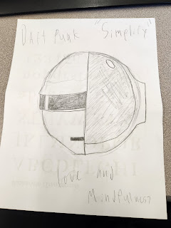
          All of my posters revolve around the duo Daft Punk, and for most of my posters I tried to implement one of the many messages that his duo usually stands for. For the first one of my posters I tried to implement the technique "Simplify" by making the design as minimalistic and simple as possible while still being comprehensible to a common viewer.  For the second one of my posters I tried to implement the technique "Create a central image" by making the design focus the viewers eyes right on the center of the poster to see the duo and call attention. For the third one of my posters I tried to implement the technique "Tell a story" by making the design tell the tale of the iconic duo while also trying to portray an underlaying message. For the forth one of my posters I tried to implement the technique "Text as image" by making the design have a large amount of text that would eventually fill up to spell out the Daft Punk logo. For the las

How posters work

Image
  Despite how boring I found the video, I did find some of the aspects and technics that she was talking about very interesting, one of these aspects and technics was something that's falls under the " Simplify " category, we can see this with the very simplistic design of the first Simpson's poster and how the very use of the iconic side homer hair is enough to make the poster make sense. Another one of these aspects and technics was something that's falls under the "Create a central image" category, we can see this with the second image and how it paints the light bulb right in the center of the screen, and how with the complete white background it makes the lightbulb the main center of attention. Another one of these aspects and technics was something that's falls under the " Tell a story " category, we can see this with the third image and how helps portray a message while also expanding on the time it was created, especially when you k

Social Justice Editorials Spreads Reflection

Image
Social Justice Editorials Spreads Reflection        I picked the topic of Immigration and how the people who embark on this journey can struggle for my Social Justice Editorials Spreads, With my  editorial montage  I wanted to portray a slight fraction of the rough emotions that go along the migration prosses for some people in the south. Some of  the challenges that I had with my visualizing data, were that 1st I didn't know what to show, and 2nd I didn't really know how to show all of my data. Some of  the challenges of working in three programs at the same time, Photoshop, Illustrator, and InDesign, were that I had to constantly readjust  my workflow to fit all of the different tool structures of all the different programs, having to switch between all 3 made me really confused  when I look for a tool, only to realize  that it's on a whole different program, this and some other little things made the use of three programs in this  Social Justice Editorials Spreads projec