Posts

Call to action poster
Image
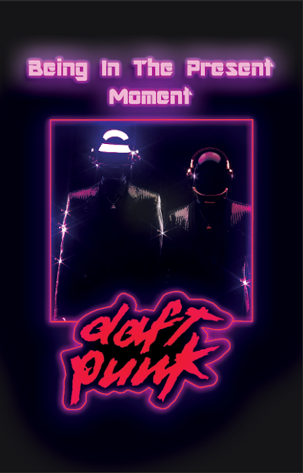
 For this "C all to action poster " project I decided to focus on one of my favorite  iconic duos, the electronic sensation of the Daft Punk duo, and one of their particular messages, specifically the one  of "Living in the Present Moment". One of the first  struggles that I came across  in this  "C all to action poster " project was finding the right images to use for the specific design that I had in mind, It was a challenge to find one that was not bright or too neon, I wanted a dark and plain image so that I would be able to add their iconic logo and my own neon glow to it. Another challenge that I came across in this "C all to action poster " project was trying to properly portray the technic of creating a central image, I found it difficult to center the entire design without loosing the main point of my overall design. One of my final struggles that I came across in this "C all to action poster " project was the addition of the n

Call to action poster

Image
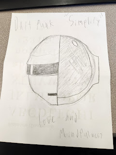
          All of my posters revolve around the duo Daft Punk, and for most of my posters I tried to implement one of the many messages that his duo usually stands for. For the first one of my posters I tried to implement the technique "Simplify" by making the design as minimalistic and simple as possible while still being comprehensible to a common viewer.  For the second one of my posters I tried to implement the technique "Create a central image" by making the design focus the viewers eyes right on the center of the poster to see the duo and call attention. For the third one of my posters I tried to implement the technique "Tell a story" by making the design tell the tale of the iconic duo while also trying to portray an underlaying message. For the forth one of my posters I tried to implement the technique "Text as image" by making the design have a large amount of text that would eventually fill up to spell out the Daft Punk logo. For the las

How posters work

Image
  Despite how boring I found the video, I did find some of the aspects and technics that she was talking about very interesting, one of these aspects and technics was something that's falls under the " Simplify " category, we can see this with the very simplistic design of the first Simpson's poster and how the very use of the iconic side homer hair is enough to make the poster make sense. Another one of these aspects and technics was something that's falls under the "Create a central image" category, we can see this with the second image and how it paints the light bulb right in the center of the screen, and how with the complete white background it makes the lightbulb the main center of attention. Another one of these aspects and technics was something that's falls under the " Tell a story " category, we can see this with the third image and how helps portray a message while also expanding on the time it was created, especially when you k

Social Justice Editorials Spreads Reflection

Image
Social Justice Editorials Spreads Reflection        I picked the topic of Immigration and how the people who embark on this journey can struggle for my Social Justice Editorials Spreads, With my  editorial montage  I wanted to portray a slight fraction of the rough emotions that go along the migration prosses for some people in the south. Some of  the challenges that I had with my visualizing data, were that 1st I didn't know what to show, and 2nd I didn't really know how to show all of my data. Some of  the challenges of working in three programs at the same time, Photoshop, Illustrator, and InDesign, were that I had to constantly readjust  my workflow to fit all of the different tool structures of all the different programs, having to switch between all 3 made me really confused  when I look for a tool, only to realize  that it's on a whole different program, this and some other little things made the use of three programs in this  Social Justice Editorials Spreads projec

Editorial Design

 Editorial Design     T he first video "Editorial Design Basics" is a video on YouTube that explores, explains, and teaches the viewer what Editorial Design is and what it is used for. The first thing the video says is that we have to do is that we need to implement a grid system because it creates a system on the page for us to follow, just like the blueprints of a structure before it is built, the video also goes on to say that we need to implement some type of hierarchy for the reader to follow without getting lost, fatigued or frustrated, one example of what we can do to make the reader stop and reflect on the reading is that we can put a double spread of an image so that while the reader stops to see and admire the image they can think about all of the information that they just received. We can implement the usage of a grid, the type hierarchy, and the use of images can be all put together so that the reader can follow all of the information while taking the time to tak

Social Justice

 Social Justice     As the son of two immigrants that left their nation for a better life to help their families and as someone who has lived in a country that can not always provide its people what they need, I want my social justice project to be based on the social justice issue of Illegal Immigration, and not based on the laws that concern immigration but on the injustices that are committed against illegal immigrants when they are captured and then deported, I feel strongly about this social issue because I have a had and still have a lot of people and family in my life that has gone through these kinds of matters and it would concern me if any of them were put in harm's way due to any type of prejudice or mishandle of power, and I know a lot of people that would share this sentiment with me. I want my work to show the world that these injustices actually happen to mostly innocent people and that we have the power to do something to help prevent the deportation progress from b

Communication Design

 Communication Design      In the search for higher areas of thought and inspiration, one can turn to some aspects of communication design. Communication design is a mixed discipline between design and information-development which is concerned with how media communicate with people. Some of the communication channels that I found were verbal, nonverbal, written and visual ways of communication. A verbal communication example is a conversation or a speech, a nonverbal communication example is waving to a friend or pointing to a restaurant menu item, a written communication example is a book or a text, and a visual communication example is a video or a picture. All of these examples are essential to making and creating any type of design, Verbal and nonverbal design can help show emotion with words and actions, while written and visual design can help solidify a message, these examples can be used as essentials when trying to portray a message with the work you create, and they can also